DAIKOKU
Location
:Nagano City

:Nagano City
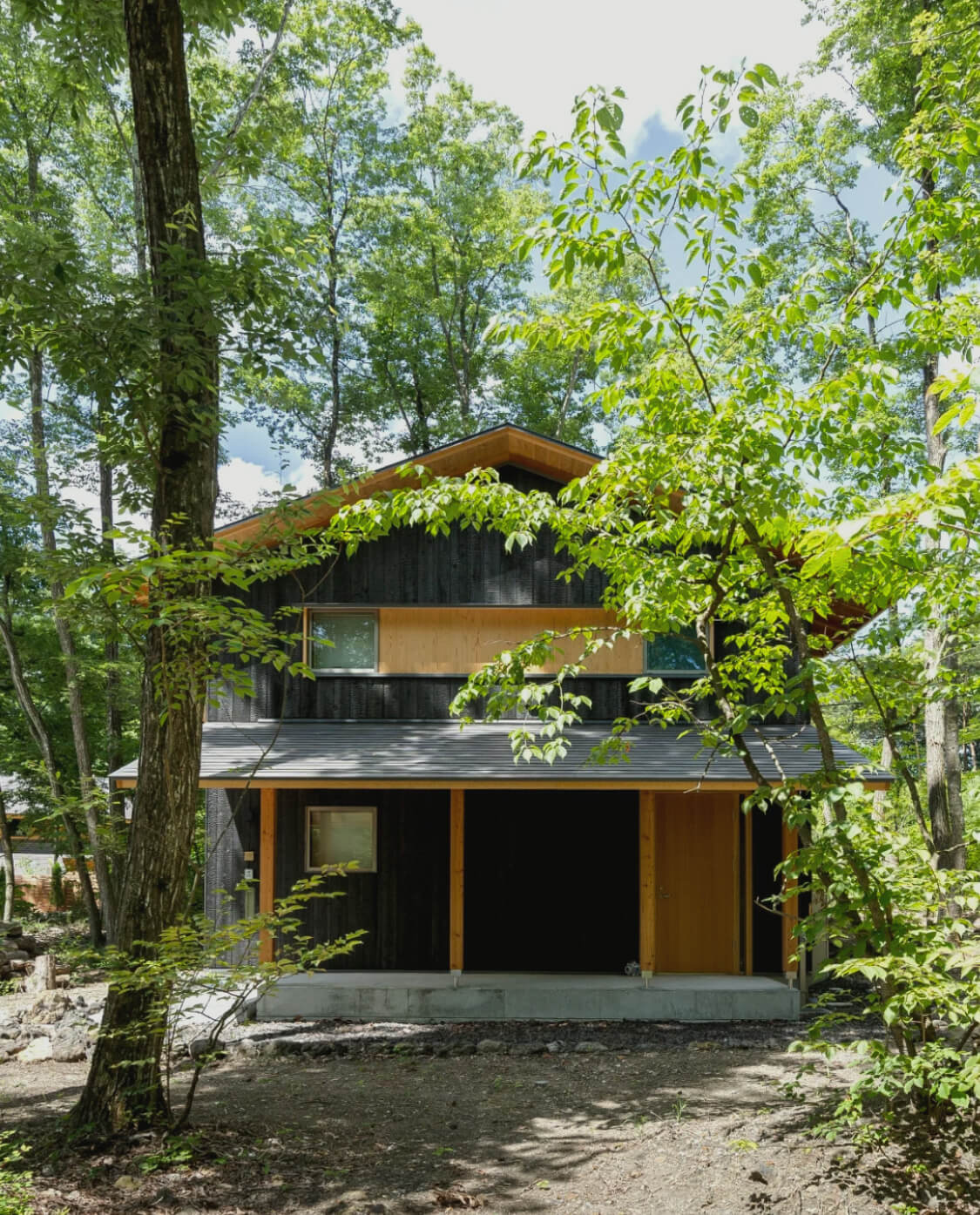
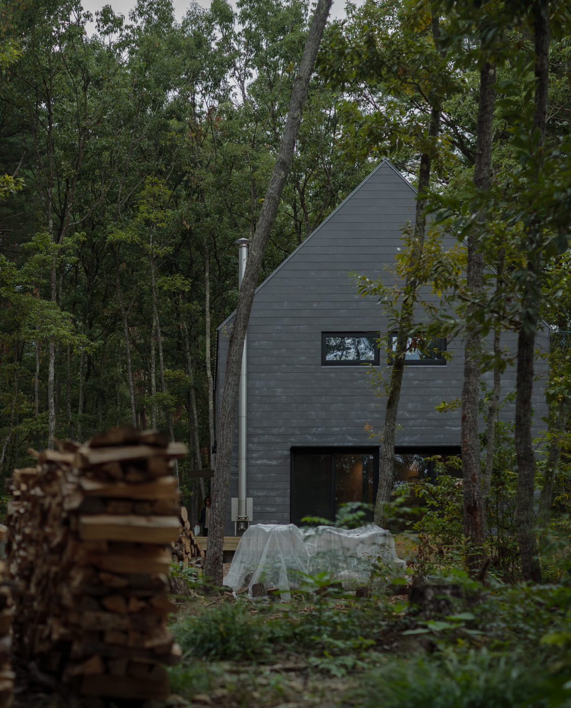
DAIKOKU(ダイコク)は、長野市篠ノ井を拠点に、地域に根ざした家づくりを続ける老舗工務店です。
ブランドの核にあるのは、住む人や地域、風景に寄り添う「謙虚な設計」という姿勢。私たちは、その思想を視覚と言葉で伝えるため、ブランドアイデンティティからウェブサイト、会社案内まで一貫してディレクションしました。
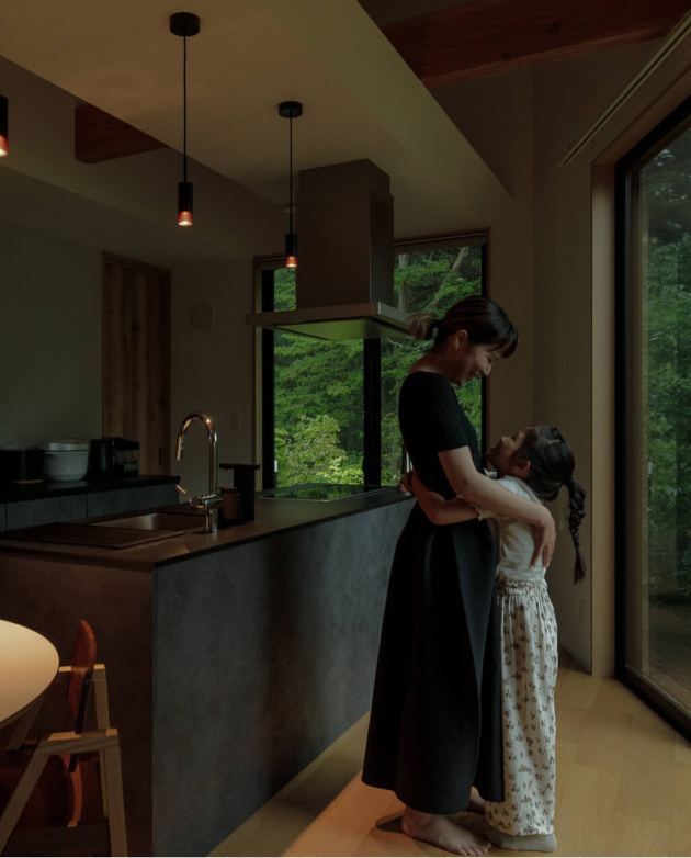
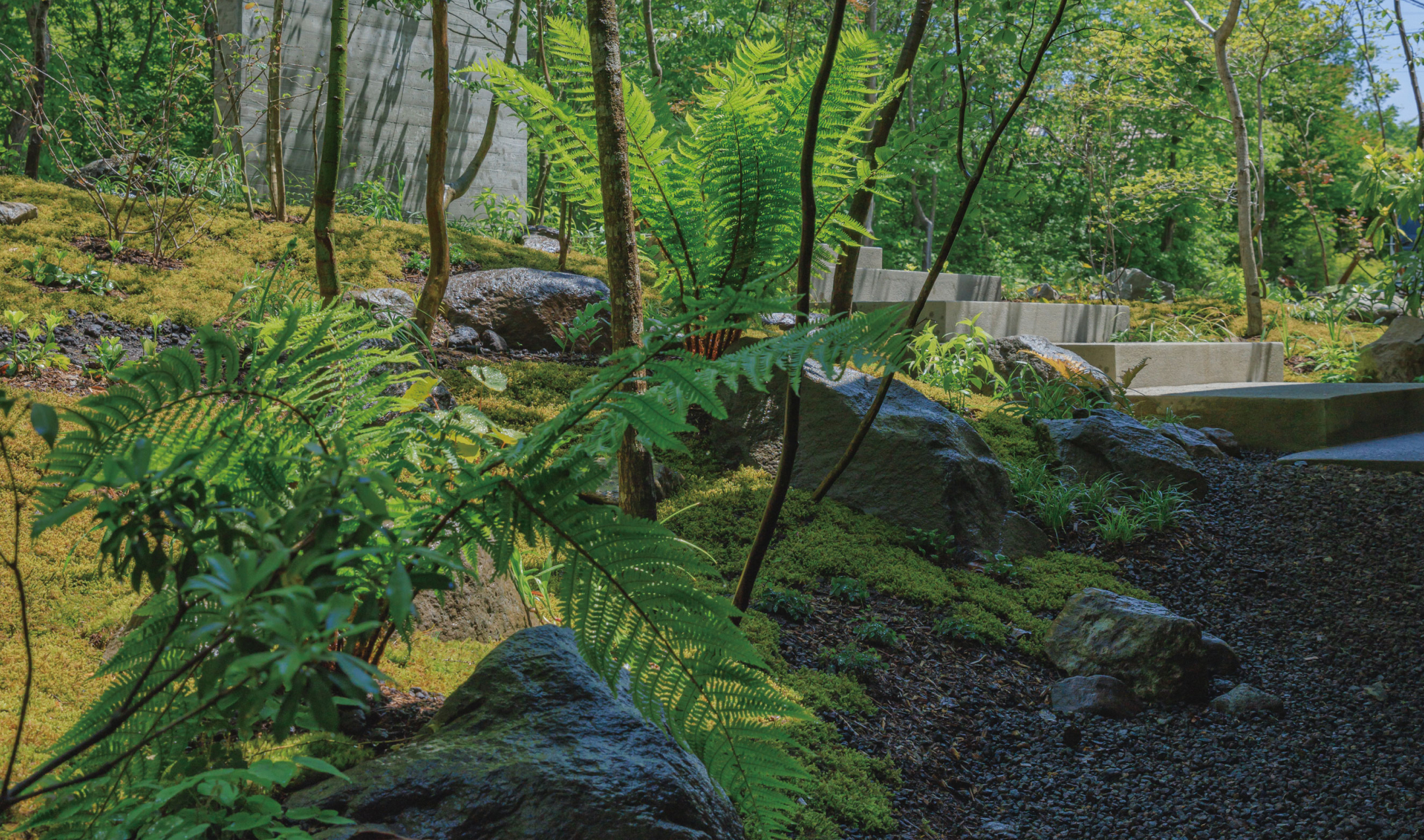
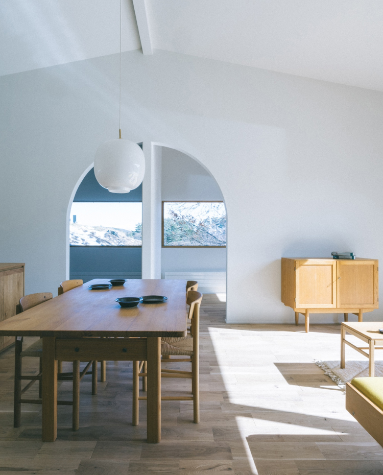
シンボルマークは、大工の「道具」をモチーフに、家紋を思わせる意匠としてデザイン。ウェブサイトでは、建築だけでなく、DAIKOKUの価値観や日々の営みまで伝わる世界観を、写真・文章・デザインを通して表現しています。
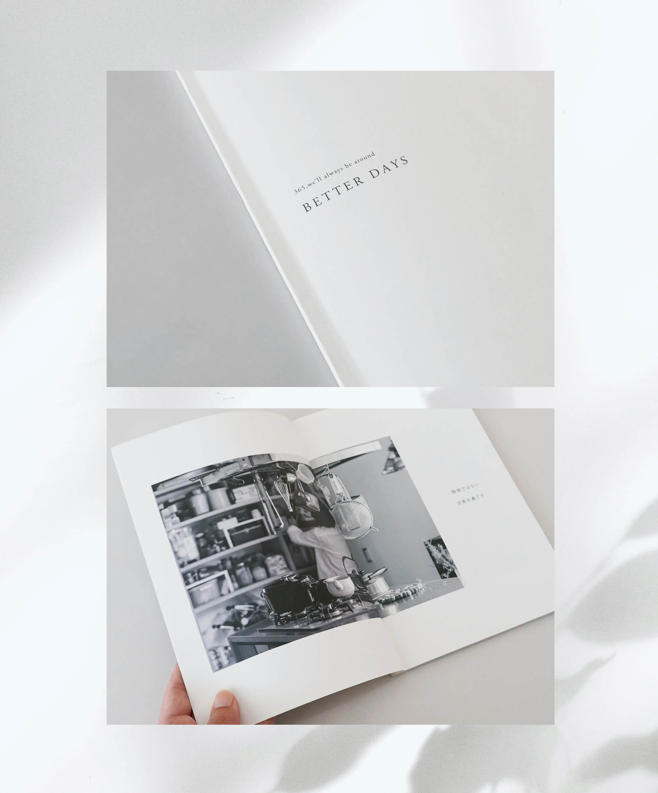
2026年の会社案内では、代表・中澤氏のブログ「日々の徒然」をもとに、家づくりへの思想や日常を一冊の詩小説として再構成。ロゴ、ウェブ、写真、文章、印刷物まで一貫した表現によって、DAIKOKUらしいブランドイメージを構築しました。
DAIKOKU is a long-established construction company based in Shinonoi, Nagano City, with a deep commitment to building homes rooted in the local community.
At the heart of the brand is an approach they call “humble design”—architecture that respects the people who live there, the local community, and the surrounding landscape. To communicate this philosophy both visually and verbally, we provided comprehensive direction across the brand identity, website, and company brochure. The symbol mark takes inspiration from traditional carpentry tools and is designed with the character of a Japanese family crest. For the website, we expressed DAIKOKU’s values and everyday practices through photography, writing, and design, going beyond simply showcasing its architecture.
For the company brochure created in 2026, we drew inspiration from “Hibi no Tsurezure,” a blog written by company representative Mr. Nakazawa, and reinterpreted his philosophy and perspective on homebuilding as a poetic narrative. Through a consistent approach across the logo, website, photography, writing, and printed materials, we created a distinctive and cohesive identity for the DAIKOKU brand.